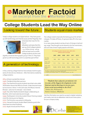
For this project, I got a lot of exposure in Indesign. I first read the text, and then sought out an image to help support the message and attract the eye of the reader.I then brought the image through photoshop to size and prepare it.
Then in INDesign, I chose a color scheme and built a palette. The next thing I did was research the company to get a feel for their purpose and log, etc.
I then worked with placing the text, chart, image, and quote as placement object , adjusted color and sizes for balance, and finally added sponsor logos on the bottom of the sheet.
Taking the feedback from the critic and a couple of my own observations, I tweaked the sell sheet by addressing it thusly:
1) Decreased the size of the general paragraph text from 12 to 10 , and changing the line spacing to allow more breathing room and white space.
2) Removed paragraph indentations
3) added lines to, and recomposed the chart. After wasting a large amount of time trying to recreate the chart in Indesign, I did it in Illustrator and placed it into Indesign. The rest of the piece remains an Indesign product.
4) added color to the bottom of sheet to give it more visual balance
5) slightly enlarge, emboldened, and italicized the quote to give it more emphasis.
6) changed position of the “selling sentence” to the end , acting more like a punch line and summation of the sheet.
No comments:
Post a Comment