Showing posts with label Indesign. Show all posts

Saturday, January 17, 2009

Digital Production - Final Project - Stormtree Studio Promo Cards


My final project was to design a couple of promotional mail-out cards to be used to advertise the benefits of my natural science illustrations. I attempted to showcase the illustrations, in addition to pointing out the strongest attributes of the work and its benefit to the customer.

I had the opportunity to work with Jim Gibson of Gibson Design http://www.gibsondesign.com/
who is responsible for the concept and original layout of the cards.... This made the re-positioning of the elements, type changes, additions of a couple features and final tweaking pretty much a passing comment.

I wanted to keep the design clean and simple, and striking to the eye. 2 additional cards remain to be layed out, in keeping with the theme,before final printing.

Tuesday, November 18, 2008

Digital Production - Project 9 - Stormtree Studio Magazine Ads

For this assignment, I created a print Ad, featuring the value of my Illustrations. I wanted to express on e of the best selling points for natural science illustration, the ability to shown the desired details of a subject, and to reconstruct and fill in for broken or missing parts of the specimen.

I utilized the work that I had done on one such project. Beginning with the photograph of broken and empty husk of an already emerged stonefly, the insect was then carefully reconstructed and the illustration portrays and image complete and whole. The colors were made more vivid and life like than the specimen, and desired details of the animal were emphasized in the pencil drawing.

I wanted to indicate or illustrate a sense of transition from the ineffective photo to the clean, accurate and vibrant illustration. Within Photoshop a created an image which I feel does so effectively, and featured that in the Indesign layout. I chose background colors and text colors to coincide with the colors of the illustration. I played with the font hierarchy, choosing to place the main header in the center of the image, being it is the punch line of the ad, but needs to be preceded by a lead in of lesser impact.

Keeping the rest of the Ad simple, I offer a quotation which expresses the point being made, a sentence about Stormtree Studio’s abilities, and then finished with a logo for branding and contact information.


Saturday, November 1, 2008

Digital Production - Project 8 - Personal Sellsheet

In this assignment, I approached the sellsheet assignment with the goal of creating something that would be part of my personal situation - Folloing the specs of the original assignment, but completely changing the context of the page.

I wanted to keep the color scheme of the original sellsheet, as it worked well for me and complimented the color in the art pieces feature in the new sellsheet. Utilizing the new logo I had designed for Ichthyography Ink, I put together an newsletter style “infosheet” called the Ichythograph … featuring a couple short informative articles, along with some visual draw from my illustrations, and a short sell paragraph, directing people to the business website for more information and eye candy.

I kept the page in a standard 2 column arrangement, but wanted to change the feel of the sheet, so loosened up the presentation with a couple of bleed images, some interesting text wraps, and a new logo, with the logo image unrestricted by its framing. I researched the content and rewrote the text entirely into two short articles, one explaining how natural science illustration is different from other art forms, and the needs it fills, and the other article with a brief definition and summary of a newer printmaking method called Gyotaku.

Saturday, October 18, 2008

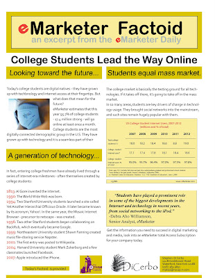
Digital Production - Project 3 - Customer Sellsheet

For this project, I got a lot of exposure in Indesign. I first read the text, and then sought out an image to help support the message and attract the eye of the reader.I then brought the image through photoshop to size and prepare it.

Then in INDesign, I chose a color scheme and built a palette. The next thing I did was research the company to get a feel for their purpose and log, etc. Then I found a simple readable text, typed the message, and chose heading sizes, and title size and typography.

I then worked with placing the text, chart, image, and quote as placement object , adjusted color and sizes for balance, and finally added sponsor logos on the bottom of the sheet.Final adjustments were used to make sure that the eye was lead around the sheet to important facts, and evoked tendency to read the body of the text.

Taking the feedback from the critic and a couple of my own observations, I tweaked the sell sheet by addressing it thusly:

1) Decreased the size of the general paragraph text from 12 to 10 , and changing the line spacing to allow more breathing room and white space.

2) Removed paragraph indentations

3) added lines to, and recomposed the chart. After wasting a large amount of time trying to recreate the chart in Indesign, I did it in Illustrator and placed it into Indesign. The rest of the piece remains an Indesign product.

4) added color to the bottom of sheet to give it more visual balance

5) slightly enlarge, emboldened, and italicized the quote to give it more emphasis.

6) changed position of the “selling sentence” to the end , acting more like a punch line and summation of the sheet.

7) Enlarge the title size and changed text style to match header, giving the title more emphasis.

Thursday, October 16, 2008

Digital Production - Project 5 - Newsletter

After reading through the text a few times, and searching the web for typical newsletters, I decided on a concept and approach to the project. The appearance of the newsletter, along with its logo would be based on one of the earliest newsletters known, a short news report in ancient Rome, known as “Daily Acts”, or Acta diuma. I wanted to express the feel of an ancient newsletter by using a brown/tan color scheme and a background (or represented paper type) of possibly, parchment.

I went with a background JPG I found called “old paper” which wasn’t parchment exactly, but gave the feel I was looking for, while representing a course paper rather than an animal skin parchment.

The photos were chosen to illustrate the text of the newsletter, and sized and worked in Photoshop. The text illustrations were made into duotone, but the newsletter logo header and a single background image, use for the character of the newsletter itself, not the article presented, worked better in CMYK, while keeping with the color scheme of the piece. The logo was constructed in Illustrator. All other work was done in Indesign. Right from the first read, it seemed to me that a table would be the best approach to present the comparative information in the article.